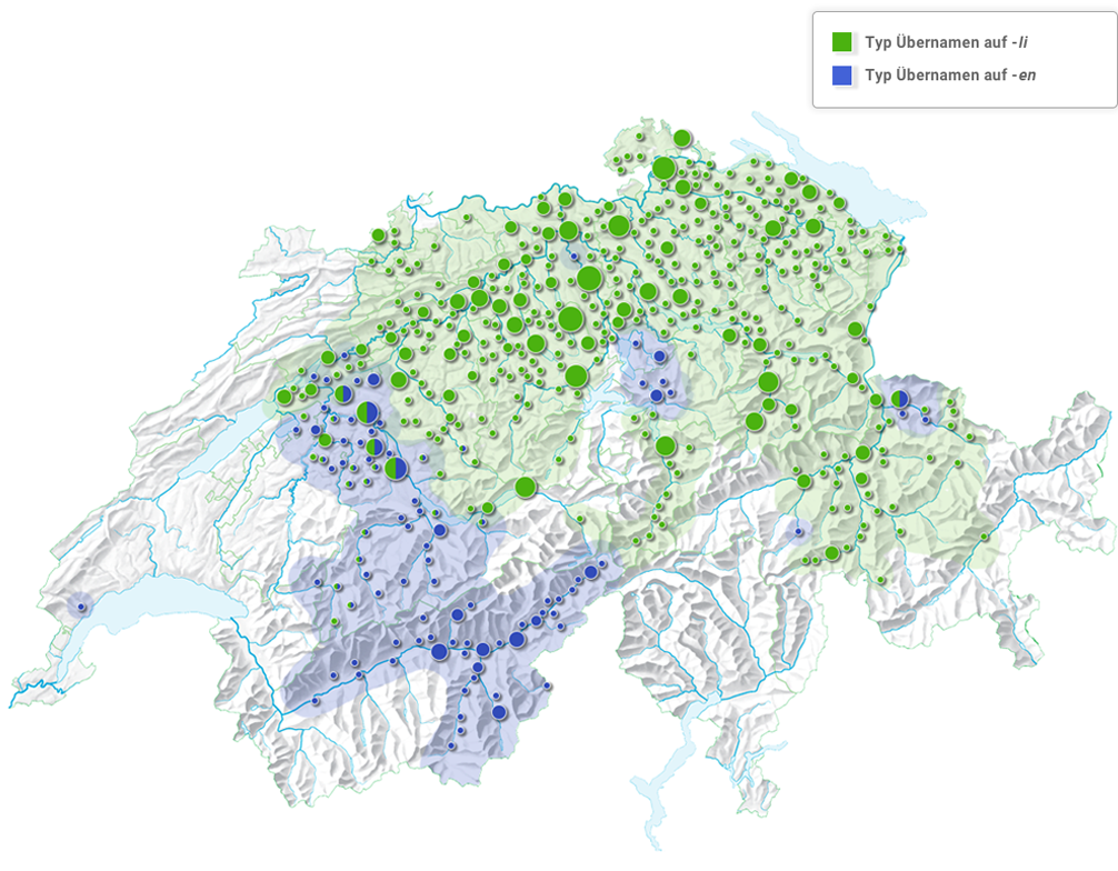
The figure shows a group mapping:
Area and pie charts were combined for the image. As a result, it becomes clearly visible that the two formation types are distributed in an almost complementary manner. The image is a preview. The pie charts roughly correspond to the representation at the municipality level. More examples will appear here shortly.
COPYRIGHT © 2021 PROJEKTE FAMILIENNAMENATLAS DER DEUTSCHWEIZ, UNIVERSITÄT BERN Content may not be reproduced, downloaded, disseminated, published, or transferred in any form or by any means.
